
How Accountants Can Use Data Visualization to Communicate Insights

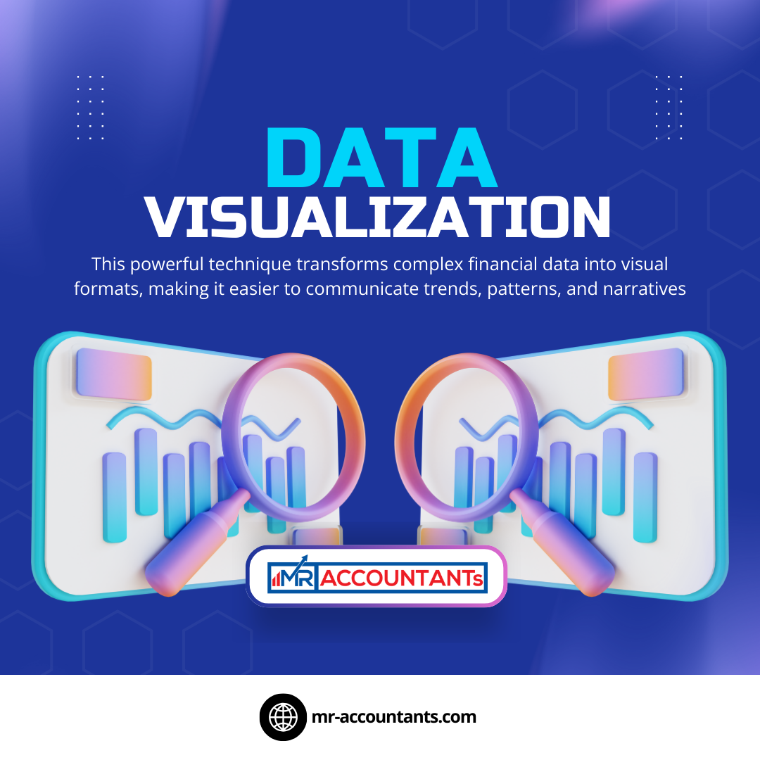
In the fast-paced world of finance and accounting, raw data and spreadsheets often fail to capture the attention and understanding of stakeholders. To bridge the gap between numbers and actionable insights, accountants are turning to data visualization. This powerful technique transforms complex financial data into visual formats, making it easier to communicate trends, patterns, and narratives.
Why Data Visualization Matters for Accountants
Data visualization is more than just charts and graphs; it is a storytelling tool. Here are some reasons why it’s crucial for accountants:
Improved Comprehension: Visual formats like pie charts, bar graphs, and heat maps allow stakeholders to quickly grasp key financial metrics.
Enhanced Decision-Making: Visualized data highlights trends and anomalies, aiding in faster and more informed decisions.
Engagement: Visual presentations are more engaging than traditional reports, ensuring stakeholders stay attentive and involved.
Key Benefits of Data Visualization in Accounting
Simplifying Complex Data: Translating intricate datasets into easy-to-digest visuals helps demystify financial jargon for non-accountants.
Spotting Trends and Patterns: Visual tools help identify seasonal trends, recurring expenses, or growth opportunities.
Highlighting Key Metrics: Dashboards and charts can emphasize critical KPIs, such as revenue growth, profit margins, or expense ratios.
Real-Time Insights: Modern tools enable real-time data visualization, allowing businesses to react promptly to financial changes.
Tools Accountants Can Use for Data Visualization
Several tools cater to the specific needs of accountants for creating impactful visuals:
Microsoft Excel: A classic tool with robust charting and graphing capabilities. It offers a wide range of templates, pivot tables, and advanced formulas that make it suitable for both beginners and professionals.
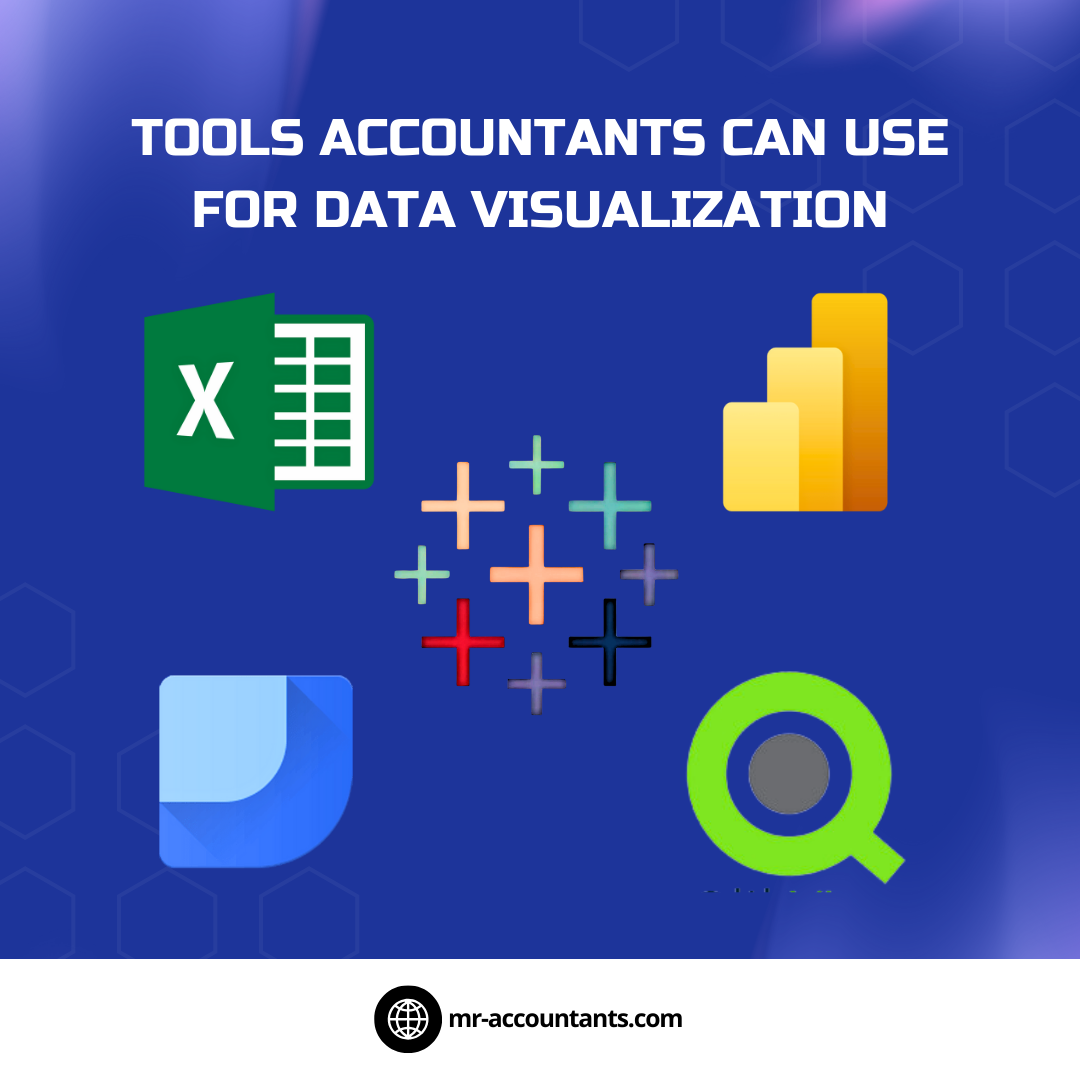
Tableau: A powerful platform for creating interactive and dynamic visualizations. Tableau excels in handling large datasets and supports integration with various data sources, making it ideal for accountants working on complex financial models.
Power BI: Microsoft’s business analytics tool, ideal for integrating with financial data systems. Its intuitive interface and strong integration with other Microsoft products like Excel and Azure make it a favorite among accounting teams.
Google Data Studio: A free, web-based platform for creating customizable reports and dashboards. Its user-friendly interface and ability to connect with Google Analytics, Google Sheets, and other data sources make it accessible for smaller accounting teams.
QlikView: A data discovery and visualization tool that helps analyze and share insights. Known for its speed and simplicity, QlikView allows accountants to create dashboards and visualizations that provide real-time insights.
Zoho Analytics: A business intelligence tool that enables accountants to create visually appealing reports and dashboards. With its drag-and-drop interface and integration capabilities, it is suitable for both small businesses and enterprises.
SAP Analytics Cloud: An advanced tool designed for financial planning and analysis. It offers predictive analytics and collaborative features that are particularly useful for accountants in larger organizations.
Domo: A cloud-based platform that allows seamless integration with multiple data sources. Domo’s focus on real-time data makes it a great choice for tracking financial performance metrics dynamically.
ChartMogul: While primarily a subscription analytics tool, it’s particularly effective for accountants in SaaS businesses, offering pre-built metrics and visualization options tailored for recurring revenue models.
Best Practices for Financial Data Visualization
Know Your Audience: Tailor visualizations to the stakeholders’ level of financial literacy.
Choose the Right Chart Type: Use pie charts for proportions, line charts for trends, and bar graphs for comparisons.
Maintain Clarity: Avoid clutter by focusing on the most relevant data points and using clean designs.
Use Color Wisely: Leverage color coding to emphasize key insights but avoid overloading with too many colors.
Incorporate Storytelling: Frame your visuals within a narrative that connects data points to business objectives.
Real-Life Applications of Data Visualization in Accounting
Cash Flow Analysis: Line graphs and waterfall charts can depict cash inflows and outflows, helping identify bottlenecks.
Budget vs. Actual Reports: Variance analysis becomes clearer when represented with bar graphs or heat maps.
Audit Trails: Flowcharts can simplify the presentation of financial processes and controls.
Tax Planning: Interactive dashboards can highlight opportunities for tax savings and compliance areas.
Financial Forecasting: Scatter plots and trend lines are effective for visualizing projections and scenario analyses.
Challenges and How to Overcome Them
While data visualization offers immense benefits, accountants may face challenges such as:
Data Overload: Ensure your visuals are concise and focus only on actionable insights.
Learning Curve: Invest time in mastering data visualization tools to maximize their potential.
Data Accuracy: Always verify data integrity before creating visuals to maintain credibility.
Conclusion
Data visualization is revolutionizing how accountants communicate financial insights. By leveraging the right tools and techniques, accountants can transform data into compelling narratives that drive smarter decision-making. As businesses increasingly rely on visual data storytelling, mastering this skill will position accountants as indispensable strategic advisors.
FAQs
1. What is the most beginner-friendly tool for data visualization in accounting?
Microsoft Excel is widely regarded as a user-friendly option, offering numerous templates and tools for basic to advanced visualization.
2. Can small businesses benefit from data visualization?
Absolutely! Even simple visuals can help small businesses track performance, manage budgets, and communicate effectively with stakeholders.
3. How do I ensure my data visualizations are accurate?
Always double-check your data sources and validate the calculations before creating visuals. Automation tools can also minimize errors.
4. Is data visualization only for external stakeholders?
No, it’s equally useful for internal teams, helping accountants collaborate effectively and make informed decisions.
5. What are some trends in data visualization for accountants?
Interactive dashboards, real-time analytics, and AI-driven insights are becoming increasingly popular in the accounting field.
By embracing data visualization, accountants can not only enhance their reporting capabilities but also empower stakeholders to see the bigger picture, making it a win-win for everyone involved.